The basketball replay on a phone
The replay was built on a laptop, and on a phone it quietly failed. Measured on a 390 by 844 phone screen, before any change:
- The timeline was 0 pixels wide, so there was nothing to drag. You could not move through the game at all.
- The full-screen button sat between 396 and 430 pixels from the left, past the edge of a 390-pixel screen.
- The clock was cut off.
- The buttons were 34 by 28 pixels, smaller than a fingertip.
Controls sized for a finger
On a touch screen, every control is now at least 44 by 44 pixels, the size the web's accessibility guidelines recommend for a touch target. On a screen narrower than 600 pixels, the timeline gets a line of its own, 346 pixels wide on that phone, and the clock takes the space that is left, on two lines when it must:
@media (pointer: coarse) {
  #bar button, #cams select, #cams button { min-height: 44px; min-width: 44px; }
}
@media (max-width: 600px) {
  #bar { flex-wrap: wrap; row-gap: 4px; }
  #track { order: -1; flex: 1 0 100%; }
  #clock { min-width: 0; flex: 1; font-size: 12px; }
}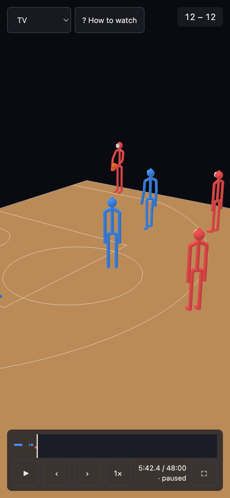
On the front page, the game's frame drops its side padding on a phone, so the court is 354 pixels wide instead of 306.
One button that explains the keys
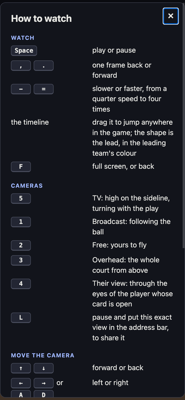
A line of key hints used to run along the bottom of the game, too small to read and impossible to fit on a phone. It is replaced by a How to watch button at the top of the replay, which also opens with the ? key. It opens a proper dialog: watching, cameras, moving the camera and players, each key beside what it does. A test fails if the replay answers a key that the dialog does not explain.
A page that says what it is
Every page now has a title and a description that say what it is, an address search engines treat as its own, and a card for when a link to it is shared. The replay's own page is titled with the two teams playing, never the score, so a link to it does not give the result away. Every page's footer shows when the version you are looking at was built, to the minute.